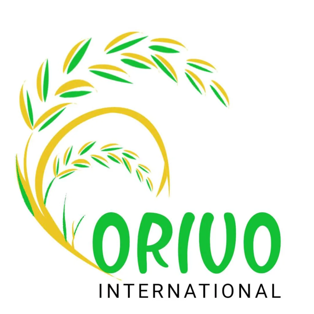
Orivo International
Case Study
Sector
Agro-Export
Based in
Bhopal, Madhya Pradesh, India
Duration
1 Week in 2017
Project Outline
Logo Design

Logo Design for Orivo International
Orivo International, an agro-export company rooted in Bhopal, embarked on a quest to define its visual identity through a logo design project. With a palette of yellow and green, reflective of its agricultural essence, the logo aimed to encapsulate the company’s commitment to sustainable farming and global commerce.
The challenge was to craft a symbol that resonated with Orivo’s ethos while ensuring recognition and versatility across various mediums.
Through collaborative efforts and creative exploration, a timeless emblem emerged, symbolizing trust, excellence, and the vibrant cycle of nature. The yellow exuded the optimism of a bountiful harvest, while green embodied the vitality of sustainable agriculture.
The resulting logo not only represented Orivo International’s values but also positioned the brand as a beacon of quality and growth in the agro-export industry.

